Why Engagement Pods Usually Hurt Public Influence Scores
Engagement pods can briefly spike a public ratio and still weaken credibility. See how InfScore weighs engagement (27%) under audience quality (32%).
This versioned composite uses only available public signals. Missing factors stay unavailable and their weight is rebalanced across observed factors. It is not a percentile, price estimate, or guarantee of campaign results. Model 2026-08-18.1.
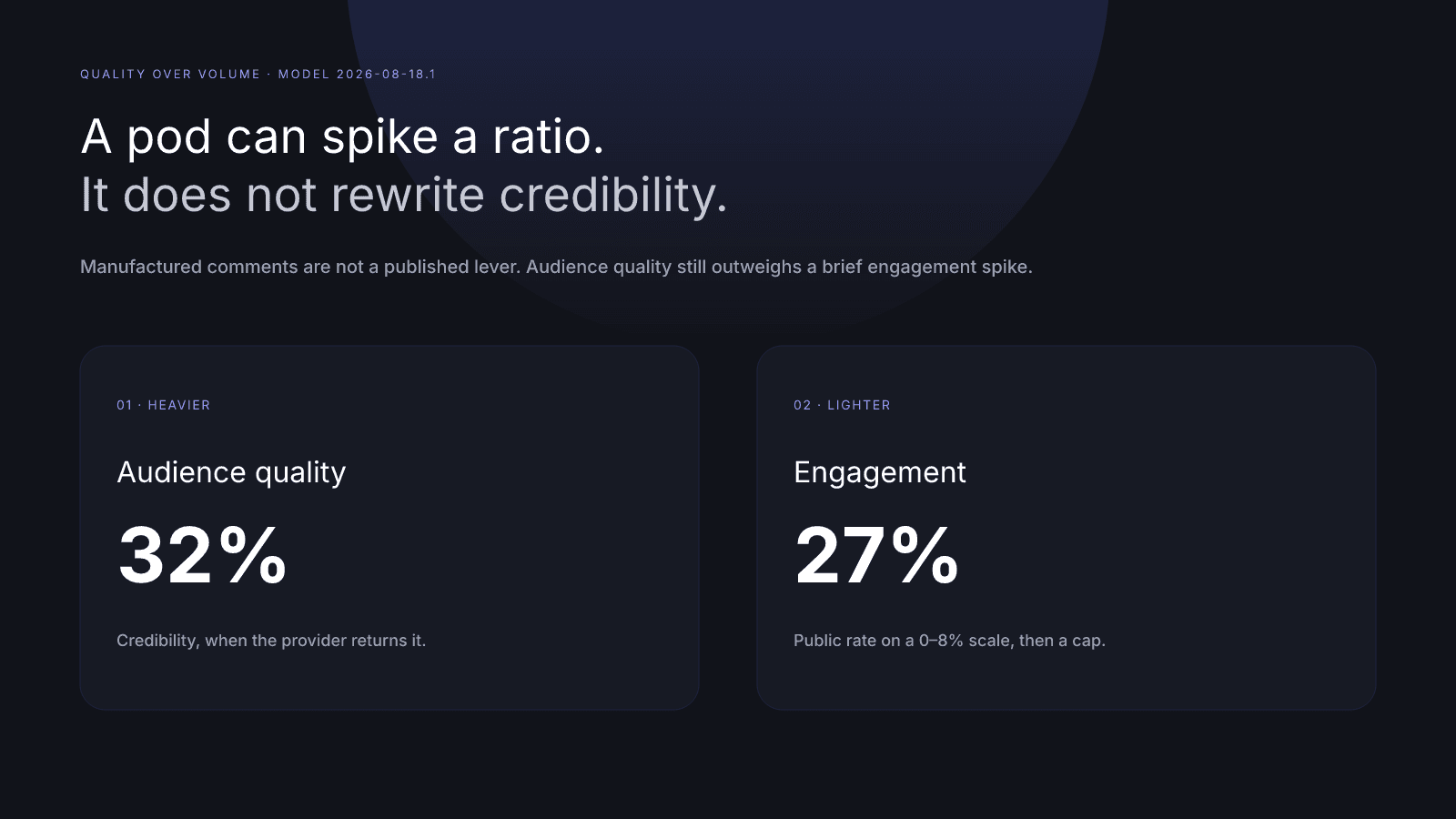
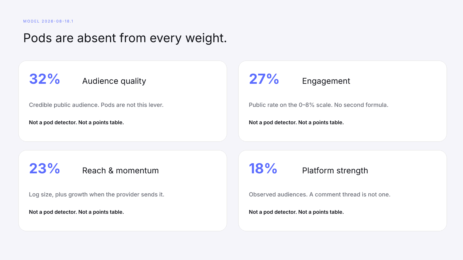
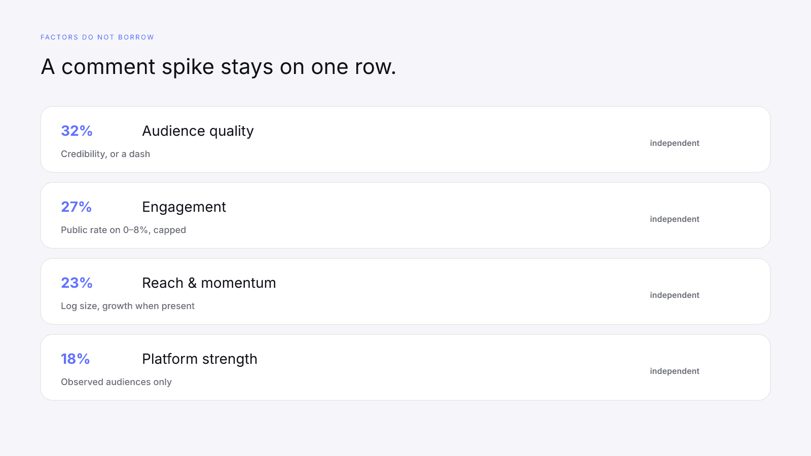
Engagement pods usually hurt public influence scores because they manufacture comment volume without building a credible audience. On model 2026-08-18.1 the mix is audience quality 32%, engagement 27%, reach & momentum 23%, and platform strength 18%. InfScore maps a public engagement rate onto a fixed 0–8% scale and scores audience quality on its own. A brief ratio spike does not rewrite the heavier credibility row. There is no pod-detection badge, no points table for leaving a pod, and no second engagement formula. Instagram, TikTok, and YouTube are lookup surfaces of that one composite, not three formulas. What follows is what a pod can change on a public card, what it cannot, and how to read the engagement row without treating manufactured volume as progress.
What an engagement pod is on a public score
An engagement pod is a group that agrees to comment, like, or otherwise pile onto each other's posts so the public ratio looks busier than the audience is. Bought comments are the same arrangement with an invoice. Either way you are manufacturing volume, and neither one is a factor in the published model.
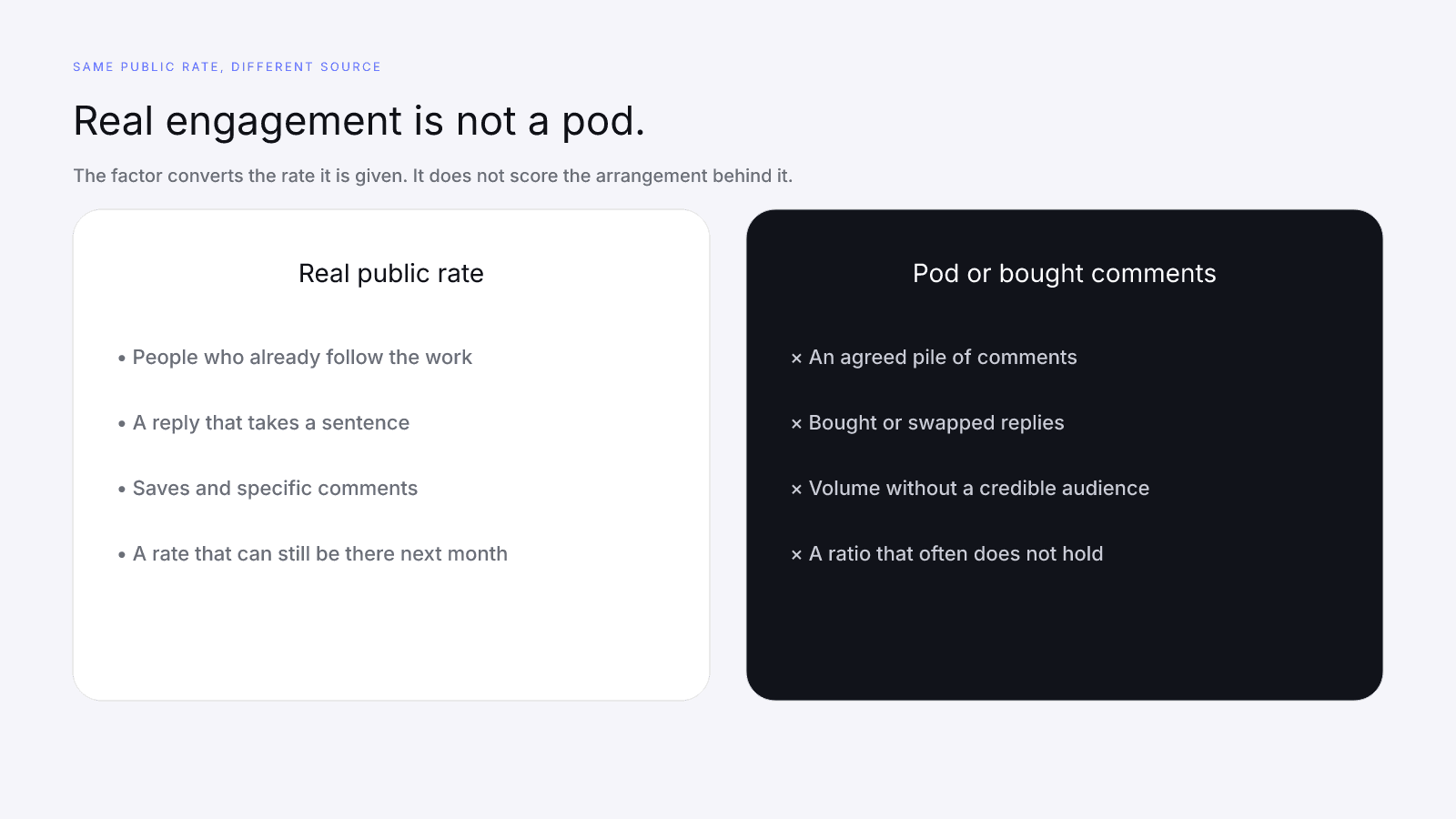
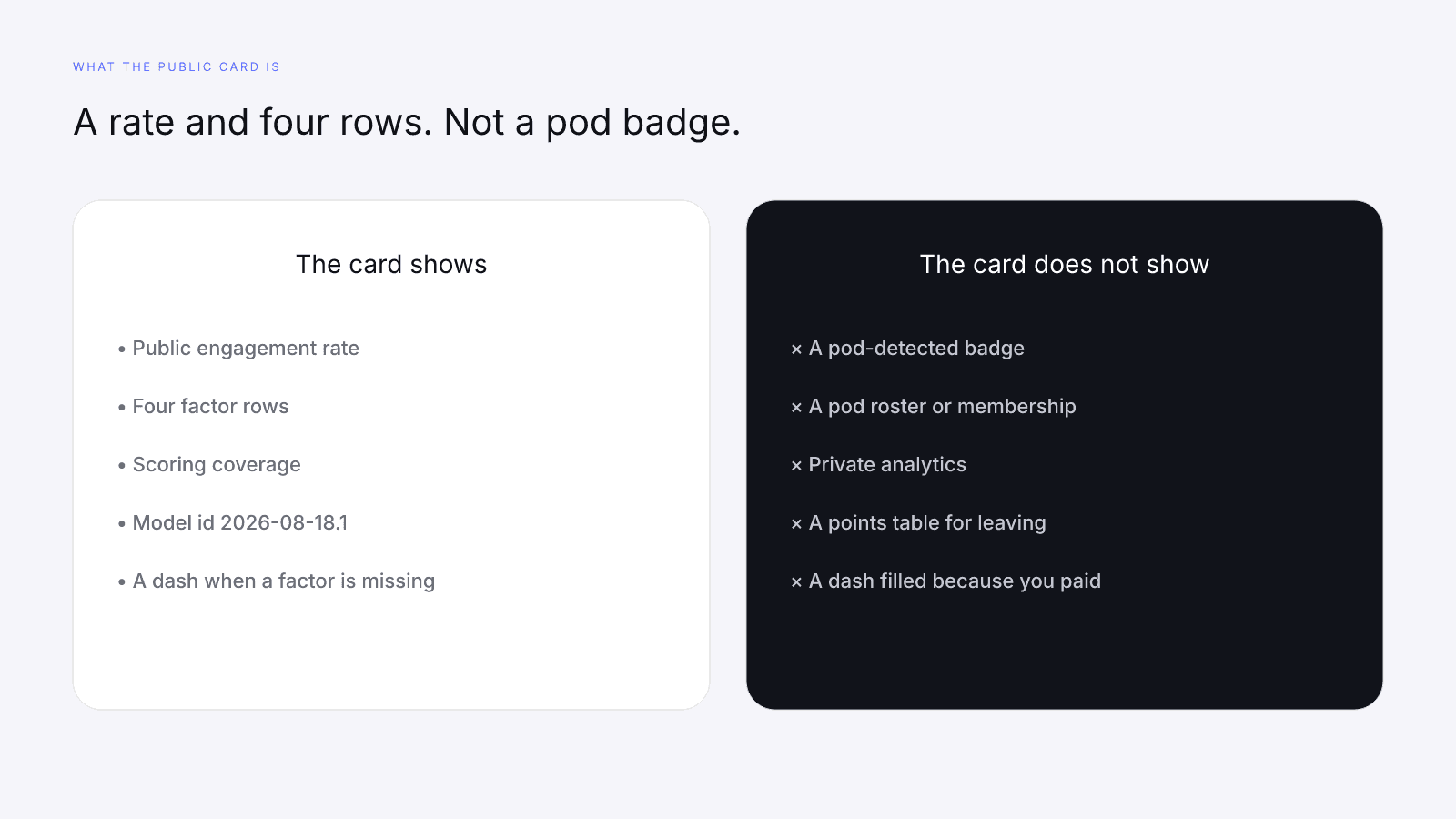
On a public InfScore card, that arrangement is not a named input. The free score uses public creator signals only. A logged-in analytics export, a pod roster, and a private list of who commented are not free-score inputs. If a provider returns a public engagement percentage, the engagement row uses that percentage. If it does not, the row is a dash. InfScore does not guess membership and then dock or award points for it.
The scorecard states the limit in one line: available factor weights are normalized when provider data is missing. There is no badge that reads "pod detected," and there is no field that reads "pod-free." Search a creator on infscore.com and you get a free 0–100 composite, a tier, four factor rows, and a scoring-coverage percentage. No signup. You do not get a confession from the comments.
So this page skips pod-spotting from a screenshot and skips a recovery schedule. The longer map of ethical public work, including the short pods note inside it, is Ethical Ways to Improve Your InfScore. The four-factor tour is How to Measure Influencer Performance.
How InfScore scores engagement (27%)
Engagement strength converts a public engagement rate onto a fixed 0–8% scale. Eight percent is the top of that scale and maps to 100 on the factor. Values above 8% are capped, so one outlier burst cannot take over the composite. A 4% public rate maps to 50. A 2% rate maps to 25. The conversion is linear until the cap, then it stops. More on that scale: What a Good Engagement Rate Looks Like in 2026.
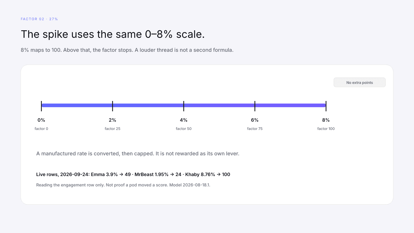
The scale does not ask where the comments came from. A rate the provider returns is the rate the factor converts, including a rate that will not be there next month. That is not a reward for pods; it is simply no second formula. Manufactured comment volume is not a published InfScore lever. There is no points table that says joining a pod is worth a set of points, and none that prices leaving one.
The cap is the part pods run into first. Once the public rate is at or above 8%, more comments do not keep adding to the engagement factor. A thread that gets louder after the cap is a louder thread. The factor has already stopped counting. The 0–8% scale does not change because the lookup surface is Instagram, TikTok, or YouTube.
If the public rate is missing, engagement is a dash, not a zero and not a silent 100. That 27% weight is held out. The remaining observed weights are rebalanced in their published proportions. Coverage falls by 27, to 73, when the other three factors ran (32 + 23 + 18). Missing Data on Creator Metrics is that arithmetic. Factors are calculated independently. A strong reach row cannot lend its points to a missing engagement row, and a noisy comment count cannot fill an engagement dash the provider did not return.
Three live lookups, opened on 2026-09-24, are a reading drill for that same map. Model id on each card is 2026-08-18.1. They are three people on one composite, not a pod study and not a before-and-after. Read the engagement factor next to audience quality. Do not stop at the engagement row.
| Live lookup | Public rate | Engagement | Audience quality | How to read the pair |
|---|---|---|---|---|
| Emma Chamberlain, Instagram | 3.9% | 49 | 84 | 3.9 ÷ 8 × 100 rounds to 49. Both rows are present. 49 is not the InfScore. |
| Khaby Lame, TikTok | 8.76% | 100 | dash | Above 8%, so the factor is capped. The credibility row was not returned. |
| MrBeast, YouTube | 1.95% | 24 | dash | 1.95 ÷ 8 × 100 rounds to 24. Same missing-data rule, a different engagement row. |
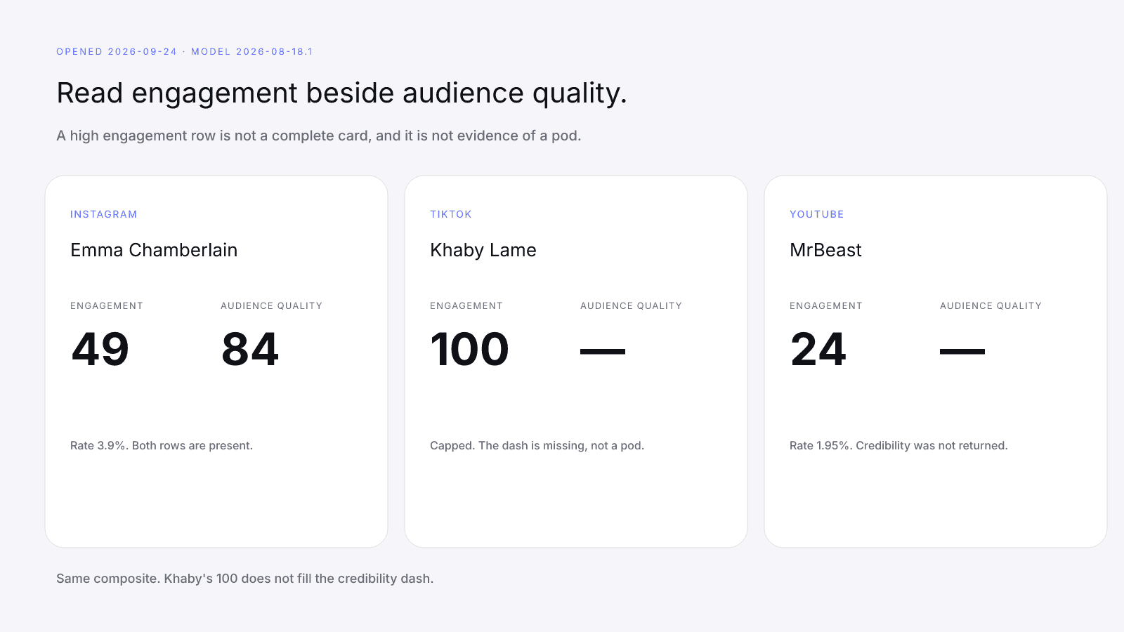
Khaby is the card that keeps the two rows apart. Engagement is 100 because 8.76% is past the cap, not because a pod was scored. Audience quality is null on that card: a dash, not a zero. Scoring coverage is 68, which is 27 + 23 + 18. A capped engagement row next to a missing credibility row is an incomplete card. High engagement is not complete credibility. The 100 does not mean a pod produced it, and it does not fill the dash. The handle on that URL is khaby.lame.
Emma shows both rows on the same composite. MrBeast shows the dash again, with engagement at 24 instead of 100. Subtracting those engagement factors, or subtracting the composites, is not an uplift. The 0–8% scale did not fork because one rate is higher.
A separate case from the model tests, not from those live cards and not from a pod, uses round numbers. Audience quality is missing, engagement sits at a 4% public rate (50 on the factor), reach & momentum is 40, and platform strength is 45. Coverage is 68. The composite is (50 × 27 + 40 × 23 + 45 × 18) ÷ 68, which rounds to 45. The engagement factor of 50 is not the InfScore. Paying does not fill the audience-quality dash, and a comment pod does not replace the scale.
Why audience quality still outweighs a spike (32%)
Audience quality is the heaviest factor because a busy comment thread on a thin audience is a noisy input. This row uses provider-measured audience credibility when that public signal exists. On the card it is a 0–100 factor score, or a dash. The longer split between size and credibility is Audience Quality vs Follower Count.
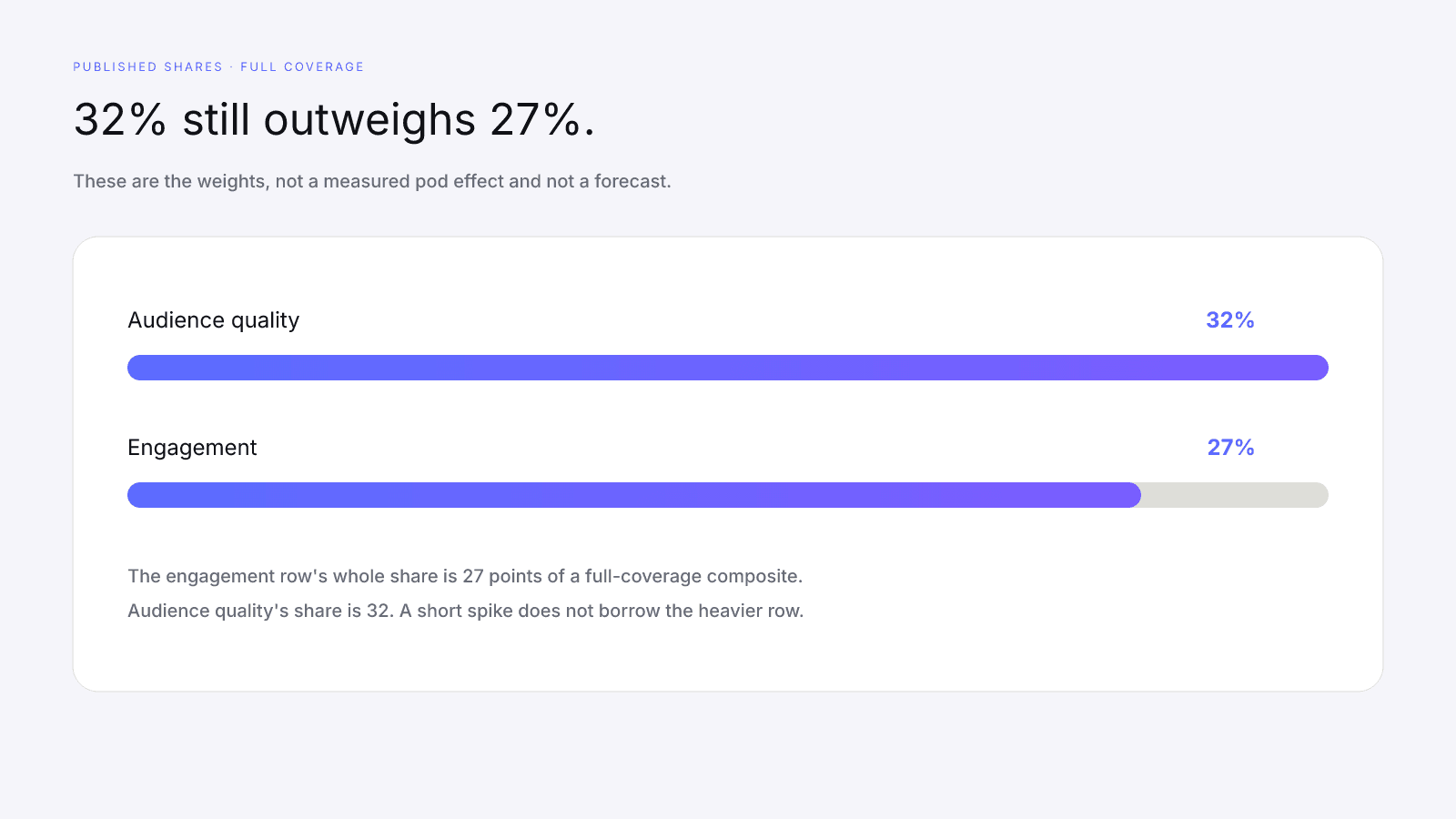
At full coverage the weights are the composite shares. The engagement row's entire published share is 27 points. Audience quality's share is 32. A short spike rarely uses the whole engagement share, because the 0–8% scale has to climb all the way to 8% before the factor hits 100, and anything past that is discarded. The spike never borrows the 32. That is just the published mix talking, not a measured pod effect and not a forecast of your next fetch.
The card-level reading is plainer. A pod can lift the raw public ratio for a stretch. The engagement factor will convert whatever rate comes back, up to the cap. The credibility row is still 32% when it exists, and manufactured volume usually leaves that audience less credible. A loss on the heavier row outweighs a similar-sized gain on the lighter one. If the provider's credibility signal is weaker, the factor says so. If the signal never arrived, the factor is a dash. No one has to confess to a pod for either of those outcomes to show up.
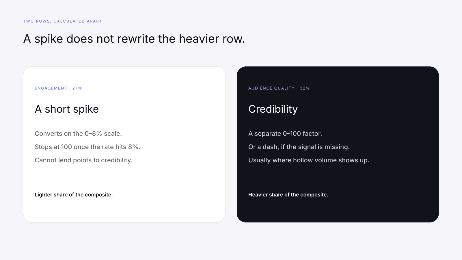
Comments from accounts that will not be there next week can move a ratio. They do not become the audience this 32% factor measures. Bought followers are the sibling mistake on the same row: a purchased headcount is size, and when the provider can see the pattern it usually shows up as weaker credibility. Pods are the comment-shaped version. Neither one is a shortcut the model scores as a win.
On the 2026-09-24 Instagram card, Emma Chamberlain has audience quality 84 beside engagement 49, with reach & momentum 83, platform strength 45, and coverage at 100%. The composite is 67, Emerging. Check the mix: (84 × 32 + 49 × 27 + 83 × 23 + 45 × 18) ÷ 100 = 67.3, which rounds to 67. The 84 carries more of that mix than the 49. That is the published weight, not a grade of a comment thread and not a number you can rent.
Khaby Lame on TikTok and MrBeast on YouTube are the other shape: audience quality dashed, coverage 68. Khaby's engagement row is still 100. MrBeast's is still 24. The missing 32% is not hiding inside the engagement factor. A media kit or a logged-in screenshot does not fill the dash, and paying does not either. The dash means the credibility signal was absent. It does not mean a pod was found, and Khaby's 100 does not mean one was used.
What a pod changes, and what it does not
A pod is manufactured public volume on the existing 0–8% engagement map. If the public rate a provider returns moves, the engagement factor on the next fetch can move with it, until the cap. That is the whole published effect on the 27% row. It is the same composite Instagram, TikTok, and YouTube already share, not a pod-specific fork. No second formula, no pod detection on the card, and no points table for leaving one.
What stays put:
- The weights. Audience quality stays 32%, engagement 27%, reach & momentum 23%, platform strength 18%, on model
2026-08-18.1. - Independence. Engagement cannot lend points to audience quality, and a comment block cannot repair a weak credibility row. Reach & momentum scores logarithmic public size, blended 70/30 with growth when a growth signal exists. Platform strength scores how many public audiences were observed. A pod does not add a platform, and a reserved username still does not count.
- The cap. Above 8%, the engagement factor stays at 100.
- A missing row. A dash stays a dash. Rebalancing uses the rows that returned a number. It does not invent the missing one.
- A label. The card does not name pod membership. Paying does not add that label later.
Reach and platform strength are easy to forget while a comment count is the number on your mind. A rented thread does not increase the follower total the log curve uses, and it does not count as a second observed audience. On this model the platform-strength floors are 45 for one observed public audience, 70 for two, and 90 for three or more, plus a small balance bonus when follower counts are not concentrated on a single network. Empty profiles do not walk those floors. The cross-platform piece is Cross-Platform Creators. The Instagram-facing map of the same four rows is Instagram InfScore Factors. TikTok's split of this engagement row against reach is TikTok Reach vs Engagement. YouTube's growth blend is YouTube Momentum Signals.
There is no published penalty schedule and no published reward schedule. If a later fetch shows a different engagement factor, the public rate changed on the scale. If a later fetch shows a weaker audience-quality row, the credibility signal changed. Subtracting two composites and calling the gap a pod result invents a table the model does not print.
Reading a live card after a ratio spike
Read the card in order: scoring coverage, then dashes, then each factor, then the 0–100 number, then the model id. A higher headline the morning after a busy thread is not evidence a pod worked. A lower headline is not a published penalty either. How to Read an Influencer Scorecard is the longer version of this order.
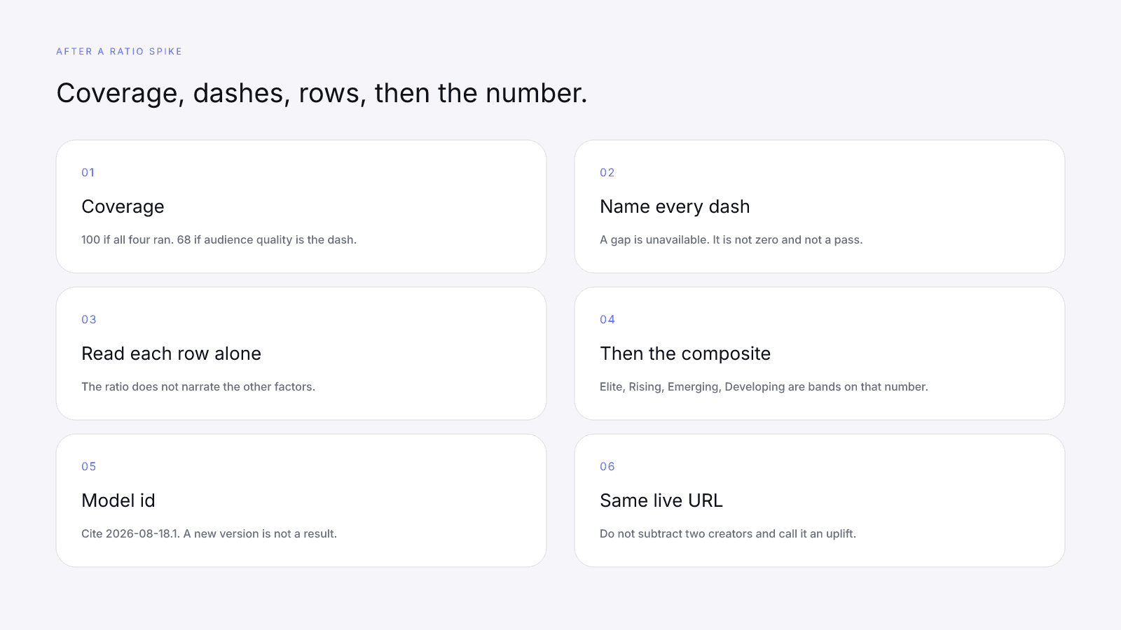
- Scoring coverage. Full coverage is 100, and the 32/27/23/18 mix applies in full. Audience quality dashed: 68. Engagement dashed: 73. Reach & momentum dashed: 77. Platform strength dashed: 82. A coverage change can move the composite even when the rows you still have did not move.
- Dashes. A dash is a gap, not a zero and not a quiet pass. Missing signals stay missing.
- Each factor on its own. Write down the engagement factor and the public rate beside it, then audience quality, then reach & momentum, then platform strength. Do not let the ratio narrate the other rows.
- The composite, after the rows. Tiers are bands on that number: Elite 90–100, Rising 80–89, Emerging 65–79, Developing below 65. Crossing a band means the rebalanced mix crossed a line. Look at which row moved.
- Model id. Cite
2026-08-18.1. A comparison across model versions is not a progress report. - The same live URL. Do not paste a homepage tile. Do not subtract two different creators and call the difference an uplift from leaving a pod.
Use the three live URLs as that drill, still as three people and still not as a result. Emma, both rows present, rounds to 67, Emerging. Khaby, audience quality dashed, is (100 × 27 + 84 × 23 + 70 × 18) ÷ 68 = 86.647, which rounds to 87, Rising. MrBeast, also audience quality dashed, is (24 × 27 + 100 × 23 + 95 × 18) ÷ 68 = 68.5, which rounds to 69, Emerging. Public audience totals on those cards are about 14.0 million, about 162.7 million, and about 745.3 million. Those totals feed reach. They do not explain the engagement row, and they do not explain the dash.
Write coverage, engagement, and audience quality before you look at 67, 87, or 69. Khaby's 100 is in the mix only as the capped engagement factor. It did not replace the missing 32%, and it is not a pod finding. Do not subtract 87 − 67, or 100 − 24, and call the gap an uplift. If you fetch the same URL again later, compare coverage and each row before the headline. That comparison is the discipline, not a before-and-after of a pod.
What to do instead of a pod
If you want a stronger engagement row, change the public rate a provider can see, and leave the credibility row intact enough that you are not trading 32% for a flicker on 27%. The work is ordinary. It is already written as public levers rather than a points menu in Ethical Ways to Improve Your InfScore. This section is the pods-specific cut, not that whole guide again.
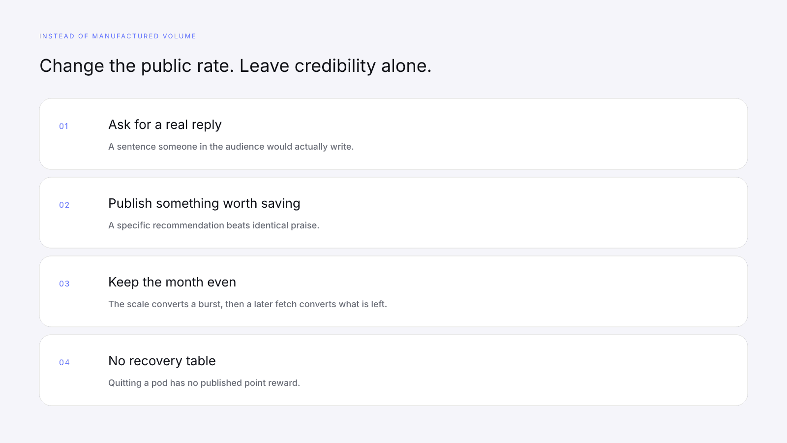
What actually touches the public rate:
- Ask for a reply that takes a sentence, then answer the people who write one. A pod comment that nobody in the audience would write does not do this job.
- Publish some posts worth saving. A specific recommendation beats a block of identical praise.
- Keep the month closer to even than to one spike. The scale converts a burst, the cap stops it, and a later fetch converts whatever rate is left.
- Retire a format that never earns a conversation. Replace it with public work. Do not replace it with a purchased comment block.
There is no recovery percentage for quitting a pod. If the public rate later looks different, a fresh fetch of the same URL can show that on the engagement row. If audience quality later looks different, that row can show it too. If neither public signal moved, the numbers should stay put. The model does not add a waiting-period bonus for having stopped.
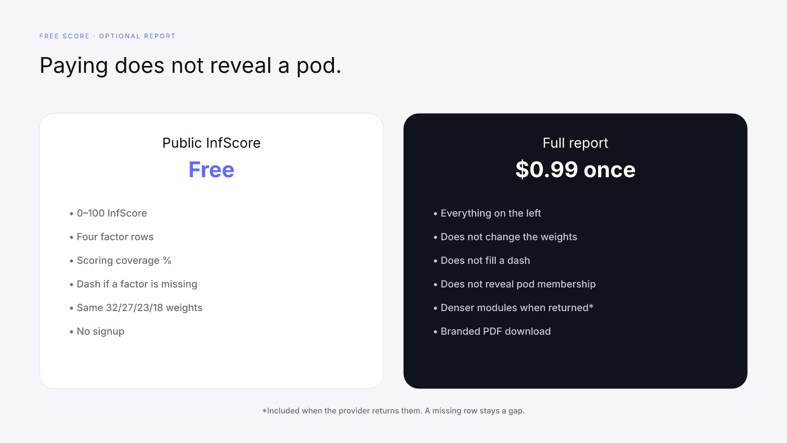
The public InfScore stays free. No signup. Pricing is one report for $0.99, once, with no subscription. The report unlocks denser provider modules when they exist. Same weights. Paying leaves the 32/27/23/18 mix alone, leaves a dash empty, and does not reveal whether an account sits in a pod.
This versioned composite uses only available public creator signals. Missing factors stay unavailable and their weight is rebalanced across observed factors. It is not a percentile, a price estimate, or a guarantee of campaign results. Search a public profile on infscore.com. Read the engagement row on the 0–8% scale, then audience quality, before you decide a busy comment thread was progress.
FAQ
Do engagement pods help or hurt InfScore?
They usually hurt, and they are not a scoring feature. A pod can inflate a raw public ratio for a stretch. Engagement maps that rate onto a fixed 0–8% scale and caps the factor at 100. That row is 27% of model 2026-08-18.1. Audience quality is 32%, reach and momentum is 23%, and platform strength is 18%. A weaker credibility row usually matters more than a brief spike on engagement. InfScore does not publish a point reward for joining a pod or for leaving one.
Can InfScore detect that I am in a pod?
No. Pod membership is not a free-score input, and InfScore does not badge it. The card uses public creator signals. If the provider returns a public engagement rate, the engagement factor converts it on the 0–8% scale. If a factor is missing, the row is a dash, not a zero. Private pod lists and logged-in analytics are not inputs.
If my public rate jumps after joining a pod, did my InfScore go up?
Not necessarily. The engagement factor can move if the public rate the provider returns actually moved, on the 0–8% scale, until the cap at 100. The composite also depends on audience quality (32%), reach and momentum (23%), platform strength (18%), and which rows are present. A spike on the 27% row does not rewrite the credibility row. Compare coverage, dashes, and each factor on the same URL before you compare the 0–100 number.
Why does audience quality matter more than a short engagement spike?
Because it is the heavier published weight. Audience quality is 32% of model 2026-08-18.1 and engagement is 27%. The engagement row's entire share of a full-coverage composite is 27 points. Audience quality's share is 32. A short spike converts on the 0–8% scale and stops at 100. It does not replace a credibility signal, and a missing audience-quality row stays a dash.
What should I do instead of pods if I want a stronger engagement row?
Do public work the provider can already see. Ask for replies that take a sentence, publish posts worth saving, and keep a month steadier than a single burst. The engagement factor converts that public rate on the 0–8% scale. There is no recovery table for leaving a pod, and bought comments are not a second formula. The longer map of those levers is the ethical public-signal guide.
Does paying $0.99 reveal pod activity or fill a dash?
No. The free InfScore needs no signup. The $0.99 report is a one-time unlock of denser provider modules when they exist, not a subscription. Paying leaves the 32/27/23/18 weights alone, leaves a dash empty, and does not reveal pod membership.
How do I compare two fetches without inventing an uplift?
Re-open the same live score URL. Compare model 2026-08-18.1, scoring coverage, and each factor row before the 0–100 composite. A row can move while the headline stays put. Do not subtract two different creators and call the gap an uplift. A change in the public rate is an engagement-row reading, not a pod verdict.