How to Read an Influencer Scorecard Without Getting Fooled
A scorecard is easy to screenshot and hard to read. Learn InfScore coverage, why dashes aren't zeros, what tier labels mean, and how to judge the four factors without vanity traps.
This versioned composite uses only available public signals. Missing factors stay unavailable and their weight is rebalanced across observed factors. It is not a percentile, price estimate, or guarantee of campaign results. Model 2026-08-18.1.
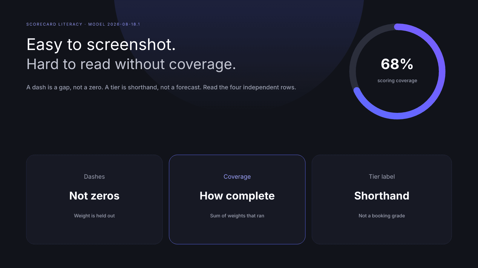
A scorecard is easy to screenshot and hard to read. The 0–100 InfScore is the composite from observed factors only. Scoring coverage is how much of the published mix actually ran: audience quality 32%, engagement 27%, reach & momentum 23%, and platform strength 18%. A dash is a gap, not a zero. A tier label is a shorthand for that same number, not a forecast or a booking grade.
This guide is how to read the public card on model 2026-08-18.1 without vanity traps: a follower screenshot, one strong row, or a label that sounds like a verdict. For the four-factor tour, start with How to Measure Influencer Performance.
What an InfScore scorecard actually shows
Search a public Instagram, TikTok, or YouTube profile on infscore.com and you get a free scorecard. No account is required. The public view keeps the comparable number and the rows that produced it. It is neither a private analytics dump nor a campaign brief.
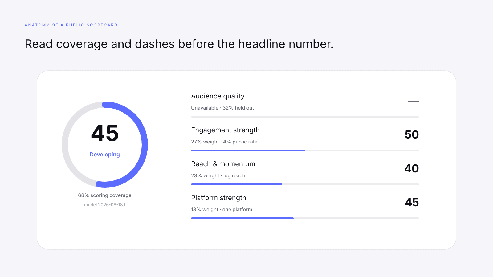
What you are looking at, in product terms:
- A 0–100 composite built from the factors that returned a number.
- A tier label for that same composite on this model version.
- Scoring coverage: the sum of the weights that actually participated.
- Four independently calculated factor rows. Each row is 0–100, or a dash.
- Headline public followers and engagement when the provider returned them.
- The model id. The current public model is
2026-08-18.1. - A primary platform for the lookup you just ran.
Independently calculated means a strong engagement row cannot lend points to a missing audience-quality row. Each factor uses its own inputs. The composite only mixes the rows that exist.
The displayed weights on the scorecard are the weights the current model uses.
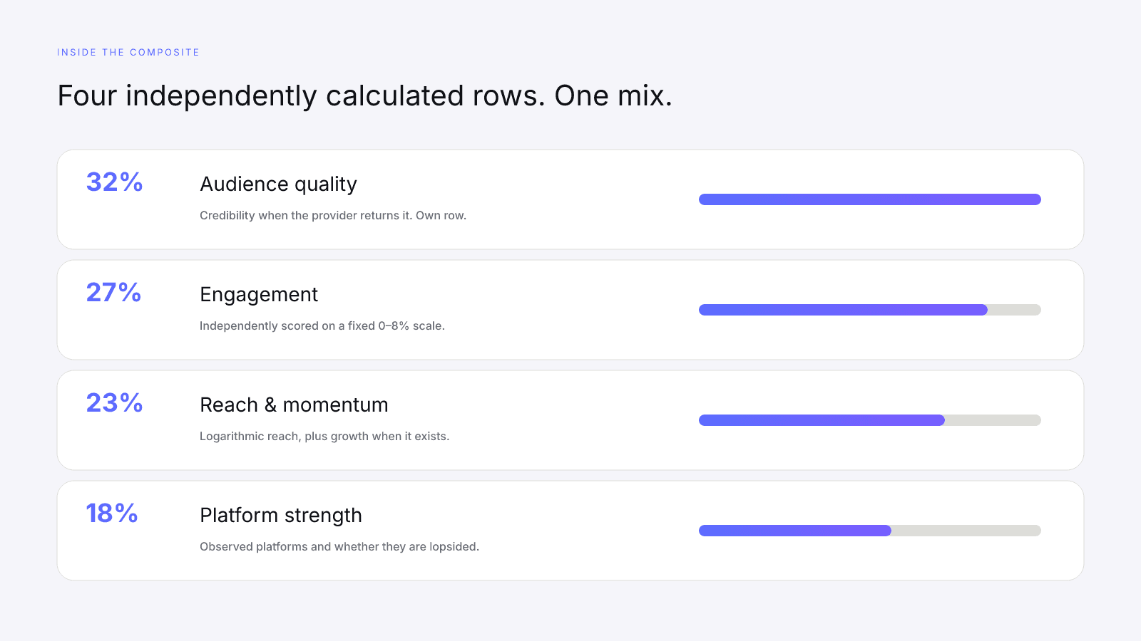
| Factor | Weight | What the row is |
|---|---|---|
| Audience quality | 32% | Provider-measured audience credibility when that signal exists |
| Engagement | 27% | Public engagement on a fixed 0–8% scale, capped at 100 |
| Reach & momentum | 23% | Logarithmic total reach, blended with measured growth when available |
| Platform strength | 18% | Observed platform coverage and balance across public audiences |
Those four numbers add to 100. They are not a mood, a percentile, or a price. InfScore does not estimate what a post should cost, rank a creator against an unpublished peer set, or promise that a brand deal will work.
The public scorecard is intentionally thin. It omits the dense provider modules so they cannot leak onto a page you did not pay for. Headline followers are a size label. Audience quality is the credibility check next to them; see Audience Quality vs Follower Count. Headline engagement is a public rate on a published scale; see What a Good Engagement Rate Looks Like in 2026.
Open a live score and read the card rather than quoting a homepage tile. The MrBeast YouTube score is a public scorecard. Example cards on the homepage are illustrative; a score URL is the product. You can also open Emma Chamberlain on Instagram the same way.
Coverage first: how complete was the model?
The number is not the first line to trust. Coverage is.
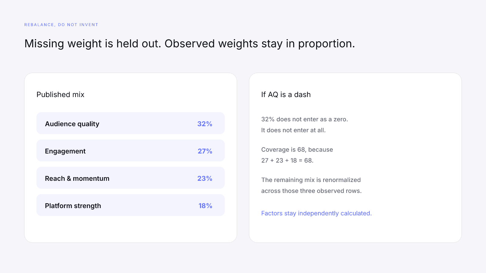
Scoring coverage is the sum of the published weights that actually ran. If every factor is present, coverage is 100 and the 32/27/23/18 mix applies in full. If a factor is a dash, its weight does not enter the composite. Coverage falls by that weight.
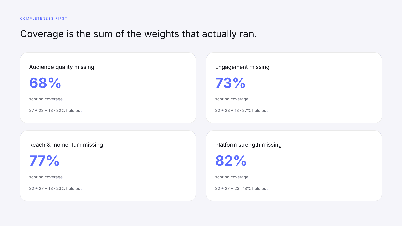
Checkable from the published mix:
- Audience quality missing → coverage 68, because 27 + 23 + 18 = 68.
- Engagement missing → coverage 73, because 32 + 23 + 18 = 73.
- Reach & momentum missing → coverage 77, because 32 + 27 + 18 = 77.
- Platform strength missing → coverage 82, because 32 + 27 + 23 = 82.
- Nothing usable present → the score is 0, with no fantasy average behind it.
Coverage is completeness, not a grade on the creator. Providers do not return every field for every public profile. A 68 is information: a third of the model did not participate. It is not an accusation.
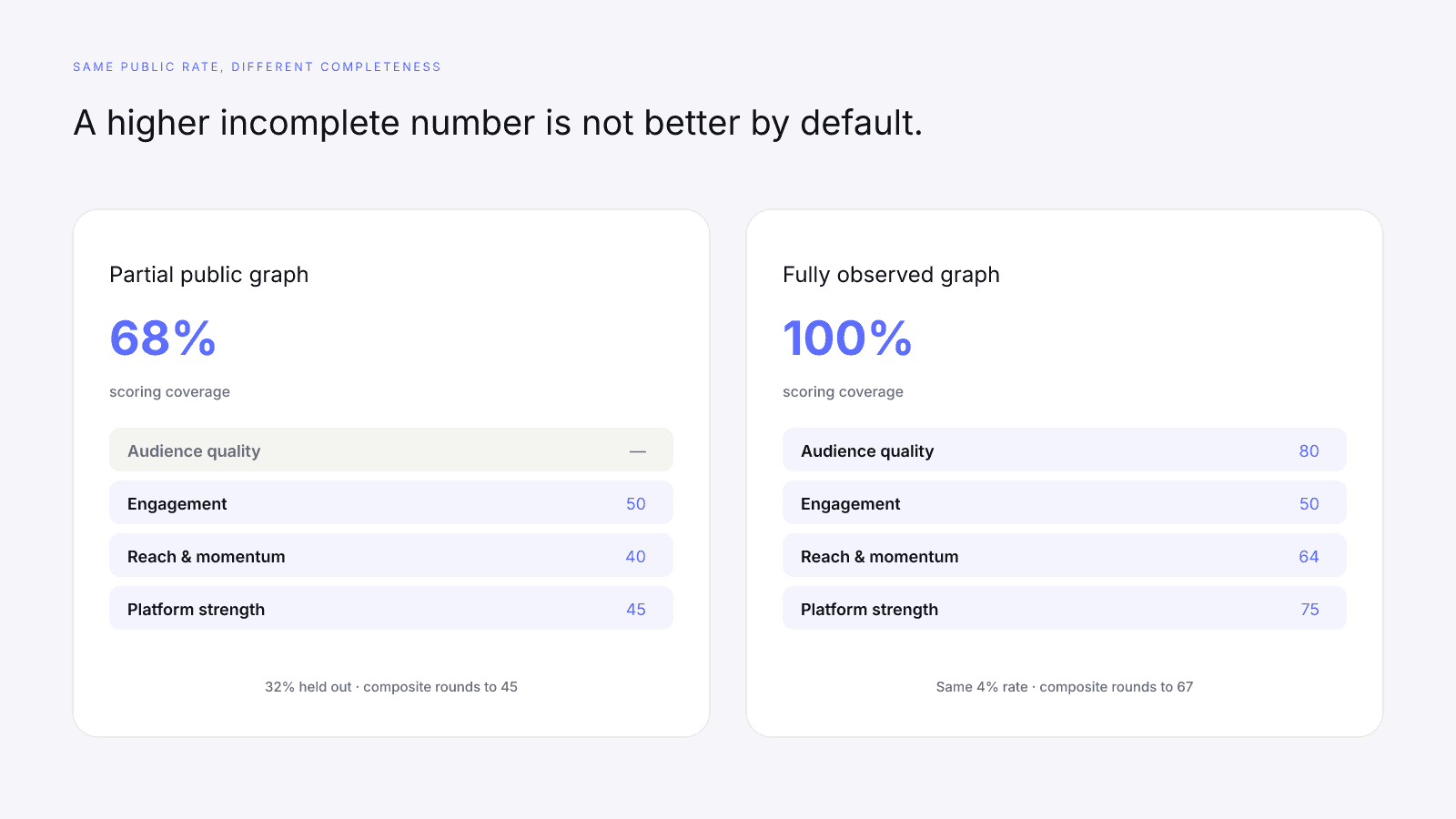
A higher InfScore with 50% coverage is not better by default than a slightly lower number with 100% coverage. Two creators with the same headline engagement can have different InfScores once coverage and the other rows are in the picture. Coverage is part of the reading, not fine print.
Compare two scores only when you also look at the model id. If the formula changes later, the version string on the scorecard changes with it. A 72 on 2026-08-18.1 is a 72 on this mix. A 72 on a later version might mean something else.
When you screenshot a score, include the coverage line and the model id. A bare 72 without those two facts is an incomplete citation.
Dashes are gaps, not zeros
If a provider signal is unavailable, InfScore shows that gap. The factor score is null on the scorecard: a dash, not a quiet zero. The copy on every public score page is the same: missing factors stay unavailable, and their weight is rebalanced across observed factors. The gap is never inferred from the final number.
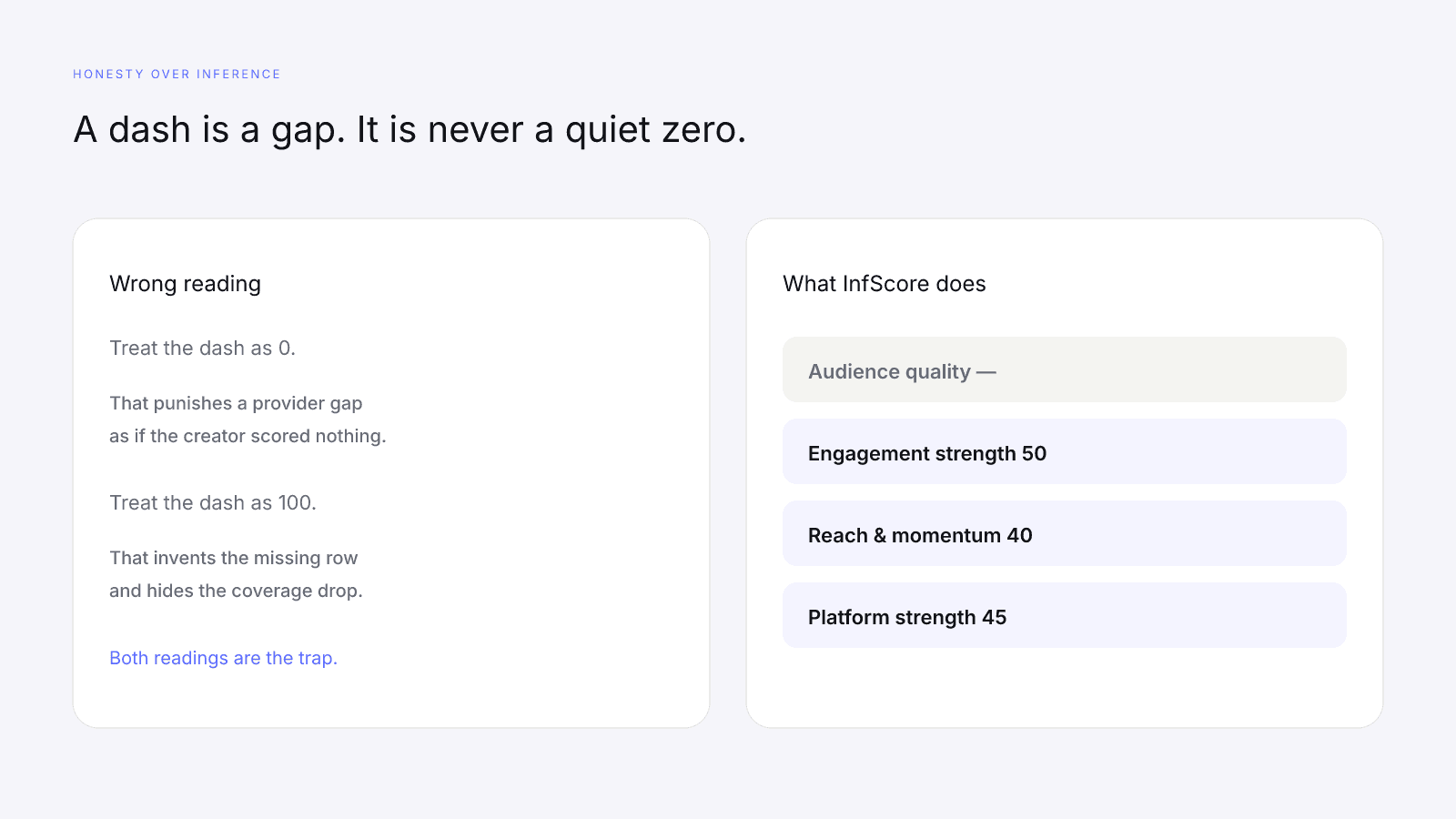
A dash is neither a failed grade nor a perfect score. Treating missing data as zero would punish a creator for a public-provider gap. Treating a dash as 100 would invent the missing row. Both are the opposite of the design.
The remaining observed weights are renormalized. The factors that returned a number still keep their published proportions relative to each other. Audience quality did not enter as a zero. It did not enter at all.
A checkable case from the model tests: audience quality missing, engagement at 4% public rate (50 on the factor), reach & momentum 40, platform strength 45. Coverage is 68. The composite rounds to 45. The 32% weight is held out. The other three rows are still real.
When you see a dash:
- Read the other factors. They are still independently calculated.
- Read scoring coverage. That percentage is the weight that actually participated.
- Do not assume the missing row would have been high, or low. You do not know.
- Do not average the visible rows in your head as if the dash were a zero.
Unavailable is a state. Coverage falls by the missing weight. That is the whole move.
Tier labels: useful shorthand, not a forecast
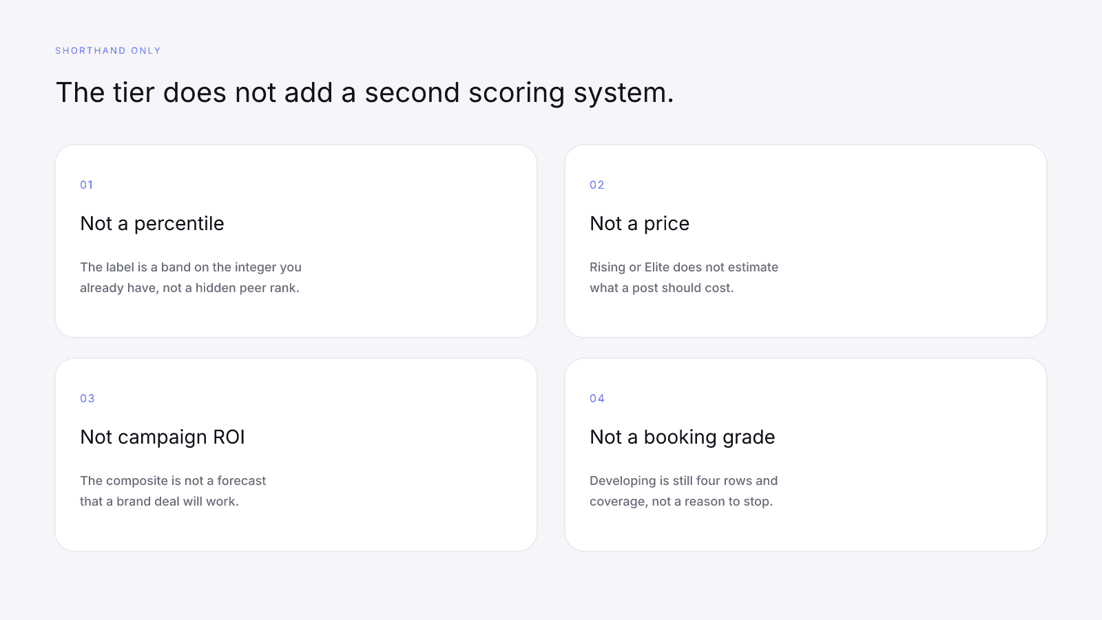
The tier is a band on the same 0–100 composite. The labels sit on that composite. They are not percentiles, peer ranks, or booking forecasts.
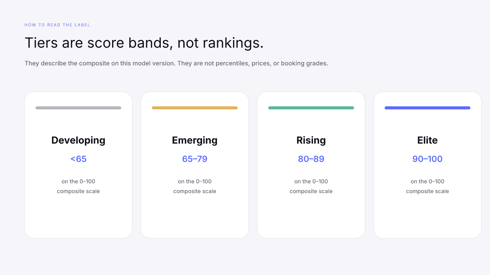
On model 2026-08-18.1 the published bands are:
- Elite — 90–100
- Rising — 80–89
- Emerging — 65–79
- Developing — <65
The label describes the composite you already have, on this version, from the factors that actually ran. A creator can sit in Emerging with excellent engagement and a thin platform graph. Another can sit in Rising with broader coverage and quieter engagement. The word next to the number does not add a second scoring system.
Do not treat a jump from Emerging to Rising as a personality change. Treat it as the composite crossing 80, then look at which factor moved, and whether coverage stayed the same.
Do not treat Elite as a booking forecast, Rising as a peer rank, or Developing as a reason to ignore the four rows. InfScore is not a campaign-ROI tool. The scorecard is direct about that. The tier is a shorthand so you can talk about the band without repeating the integer.
If coverage is partial, the tier still describes the composite that was computed from the observed mix. It does not fill the dash. A Rising label with 68% coverage is Rising on 68% of the model, not a forecast of what the missing 32% would have done.
A foolproof reading checklist
Read the free card in this order. Skip a step and the screenshot starts lying.
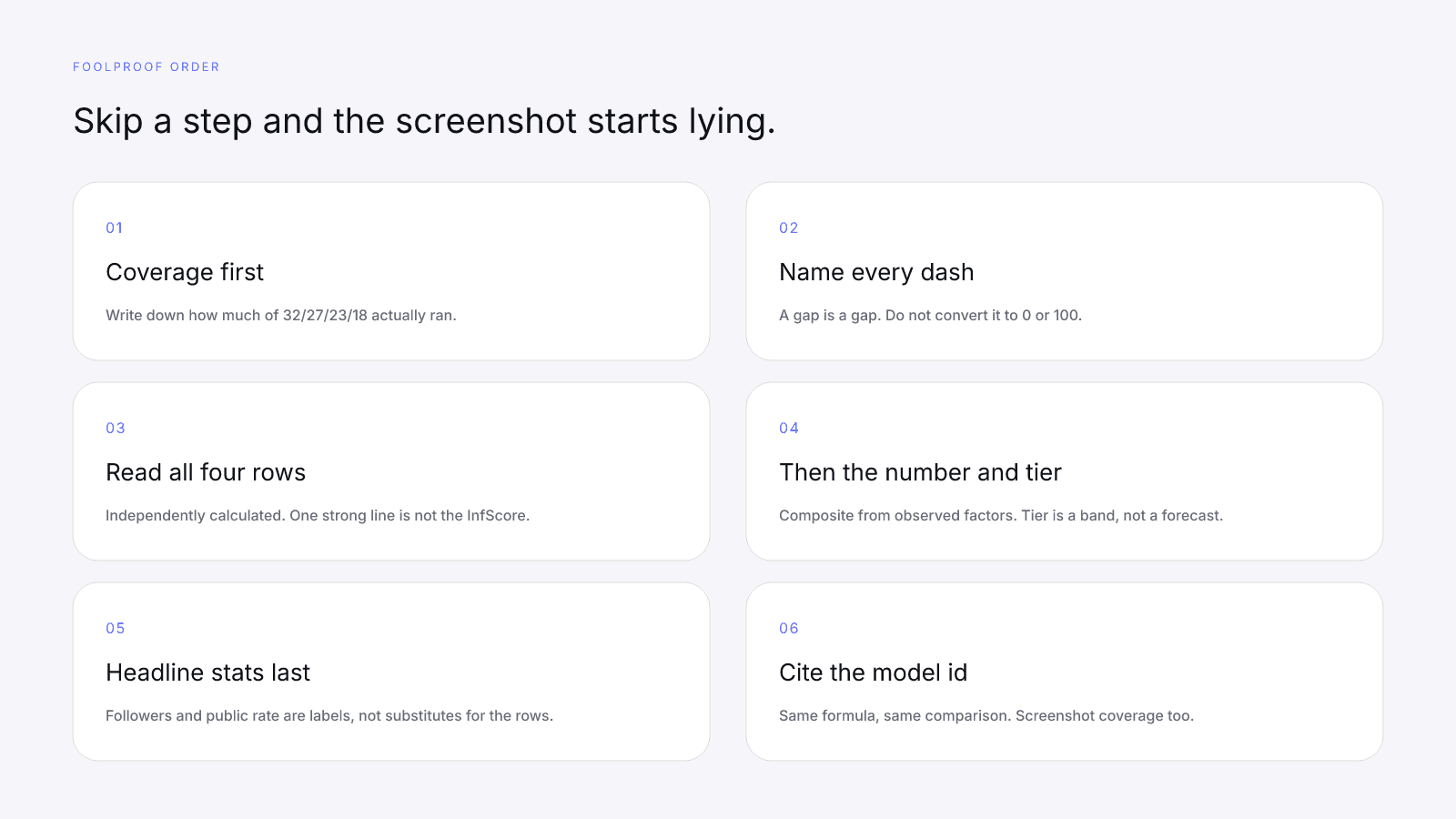
- Scoring coverage. How much of the 32/27/23/18 model ran. Write the percentage down.
- The dashes. Each dash is a gap. Name the missing factor. Do not convert it to a zero or a 100.
- The four rows. Audience quality, engagement, reach & momentum, platform strength. Independently calculated. One strong row is not the InfScore.
- The 0–100 number and the tier. This is the composite from observed factors only. The tier is a band on that number.
- Headline followers and engagement. Size and public rate when they exist, not the full analytics package, and not substitutes for the factor rows.
- Model version. Same formula, same comparison; different version, different conversation. Cite
2026-08-18.1with the screenshot. - A live score URL, not a homepage tile. Example cards on the homepage are illustrative. Open the MrBeast YouTube score if you need a worked public card.
Then decide whether you even need more than the public card.
The public InfScore stays free. No signup. The denser report is a one-time $0.99 unlock, not a subscription. Pricing is one report, one dollar, no recurring fee. Paying does not purchase a friendlier mix, fill a dash, or move the 32/27/23/18 weights. It adds provider modules when they exist.
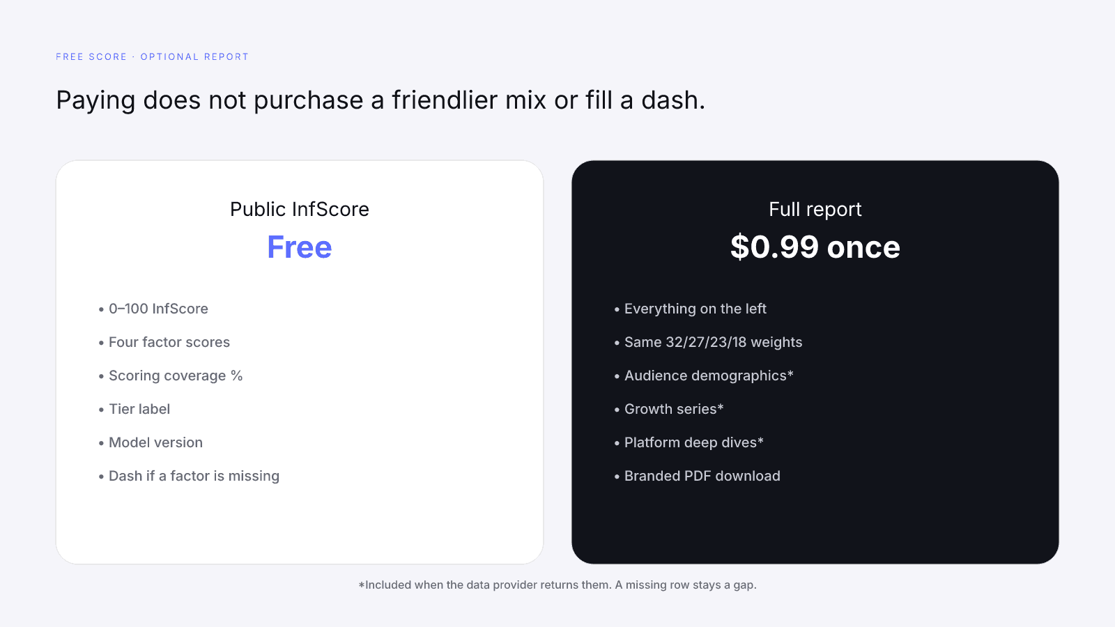
Use the paid report when you need to explain the score to someone else. Use the free score when you need the comparable number quickly. Both views are honest about gaps. The paid view is simply denser.
Vanity traps that still fool people
These are the shortcuts that survive in a screenshot and fail on the actual card.
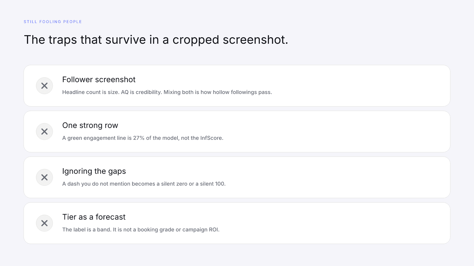
The follower screenshot. Headline count is size. Reach still scores that size on a log scale as 23% of the model. Audience quality is 32%, and it is a credibility signal when it exists. A large following can still have a weak or dashed AQ row. Mixing both into one vanity crop is how hollow followings pass a first glance.
One strong row. A high engagement factor is a 0–8% conversion on 27% of the model. A high reach factor is logarithmic size, plus growth when it exists. Neither row can borrow points for a missing neighbor. Cropping the card to the greenest line is not a reading.
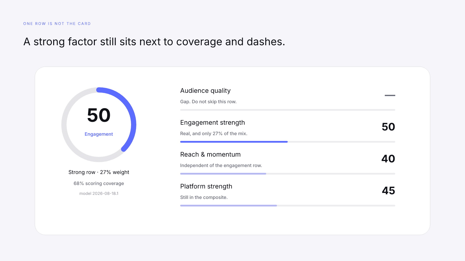
Ignoring the gaps. A dash you do not mention becomes a silent zero or a silent perfect score, depending on what the reader wants. Coverage is the correction. If AQ is missing, say 68% of the model ran. If you cannot say that, you are not citing the score.
Treating the tier as a forecast. Elite, Rising, Emerging, and Developing are labels on the composite. The label does not outrank the four rows, and it is not a percentile, peer rank, or booking forecast.
Quoting a homepage tile. Example cards on the homepage are illustrative. A live /score/ URL is the product. If you need a worked public example, use the MrBeast YouTube score or Emma Chamberlain on Instagram, and include coverage and the model id in the citation.
This versioned composite uses only available public creator signals. Missing factors stay unavailable and their weight is rebalanced across observed factors. It is not a percentile, price estimate, or guarantee of campaign results.
A scorecard will keep being easy to screenshot. Coverage, dashes, and the four independent rows are still the reading that decides whether that screenshot is a number or a crop. InfScore is the part that holds still long enough to compare.
FAQ
How do I read an InfScore scorecard?
Start with scoring coverage, then the dashes, then the four factor rows, then the 0–100 composite and tier. The number is only the mix of factors that actually returned a value on this model version.
What is scoring coverage on InfScore?
Scoring coverage is the sum of the published weights that actually ran. Audience quality is 32%, engagement 27%, reach and momentum 23%, and platform strength 18%. If audience quality is missing, coverage is 68, because 27 + 23 + 18 = 68.
Does a dash on an InfScore count as a zero?
No. A dash is a gap in public provider data. That factor's weight is held out and the remaining observed weights are rebalanced. Treating a dash as zero would punish a provider gap, which is the opposite of the design.
What do InfScore tier labels mean?
Tiers are labels on the same 0–100 composite. On model 2026-08-18.1 they are Developing <65, Emerging 65–79, Rising 80–89, and Elite 90–100. They are not percentiles, peer ranks, or booking forecasts.
What are the four InfScore factors and their weights?
Audience quality is 32 percent, engagement is 27 percent, reach and momentum is 23 percent, and platform strength is 18 percent. Each factor is calculated independently. The composite only mixes the rows that returned a number.
Is the free InfScore different from the $0.99 report?
The free score is the same 0–100 composite, four factors, coverage percentage, and headline reach. No signup is required. The one-time $0.99 report unlocks denser provider modules when they exist. Paying does not change factor weights or fill a dash.
Can one strong factor stand in for the whole InfScore?
No. A high engagement or reach row is one independently calculated factor, not the scorecard. Read coverage and the other rows, including dashes. A strong slice next to a gap is an incomplete reading, not an automatic win.